
‘Millions of years ago, one of our ancient human ancestors found a piece of stone, pounded it, sharpened it and turned it into a tool. It was a giant leap towards the evolution of humankind. As early humans began to live together in settled communities, that stone tool was not just for survival, it also became a tool to create art. Thousands of years ago, even before writing systems took hold and began to shape our ideas, people in India and Egypt had already drawn dancing figures on cave walls—the first record of “dance” in human history.
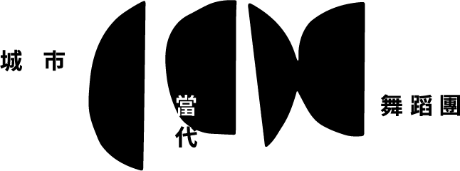
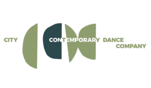
The original idea for the design of our new logo was this piece of stone. It is split into two halves, separated and copied to spell out “CCDC”. These letters represent our dancing community. They are both stretched, as in free-style dancing, while also presenting some of the tensions of rhythm. It encapsulates the shared emotions between two people, within a community and between different communities.
The new logo design also embodies the idea of humans jumping in and out of nature; the visual is extremely concise. The lines are hard and clean, colored a gentle grey-green, balancing out the roughness. This simple abstract graphic is easy to recognize and flexible in use. It is timeless, fit for the diverse performing styles of the dancing community, raising the visibility of their brand.
In 2019, City Contemporary Dance Company celebrated its 40th anniversary. A year earlier we had been invited to collaborate on designing the new logo for the dance community. We took more than a year, trying out various ideas but there was always something stopping us from making that final decision. In 2021, we eventually found that piece of stone: the starting point of human culture. We hope the new logo expresses the original intention of our dancing community. That is, to inherit the culture of the city through dance.’
Design Concept by Kent Fok (TN Peacock)